Usability #18880
closedAnnual Audit Plan Window -> Various Issues in this page
0%
1. Login as admin
2. Click on annual audit plan and enter data in all mandatory fields
3. Click on planned audit and then click on auditee selection popup
Description
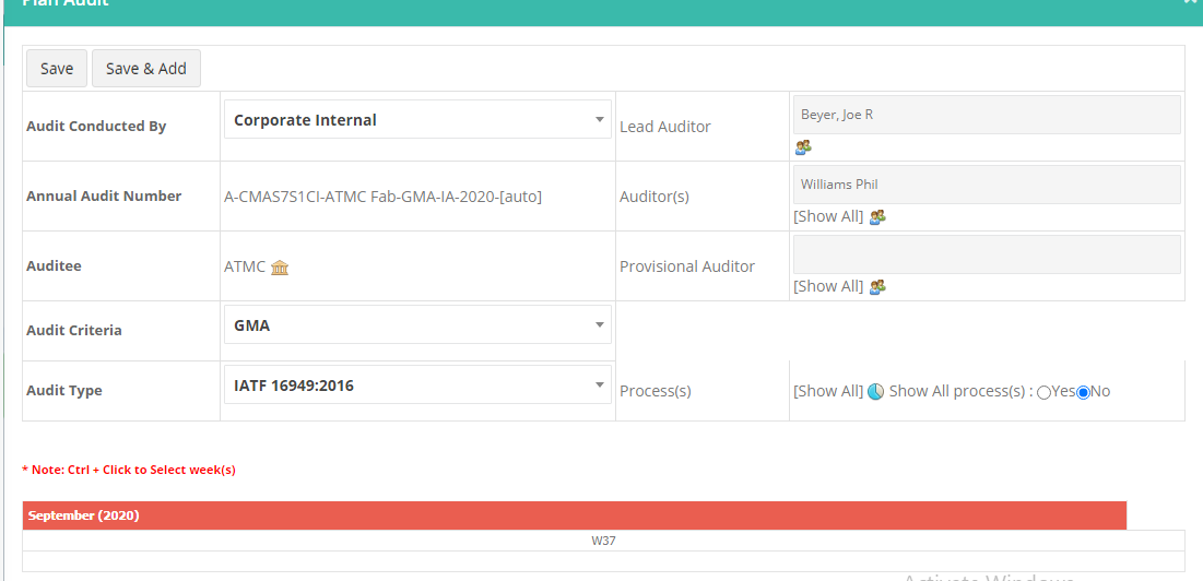
1. The overall UI is not good. lot blank space is displaying and there is no consistency in labels and order
2. Lead auditor and Auditor's data size is too small when compared with other fields
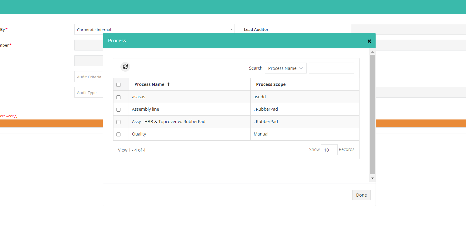
3. Process Selection - Done button is displayed in right side of the page / Audit schedule > Show all process>Reduce the font size and avoid the double scroll. Done button need to convert.
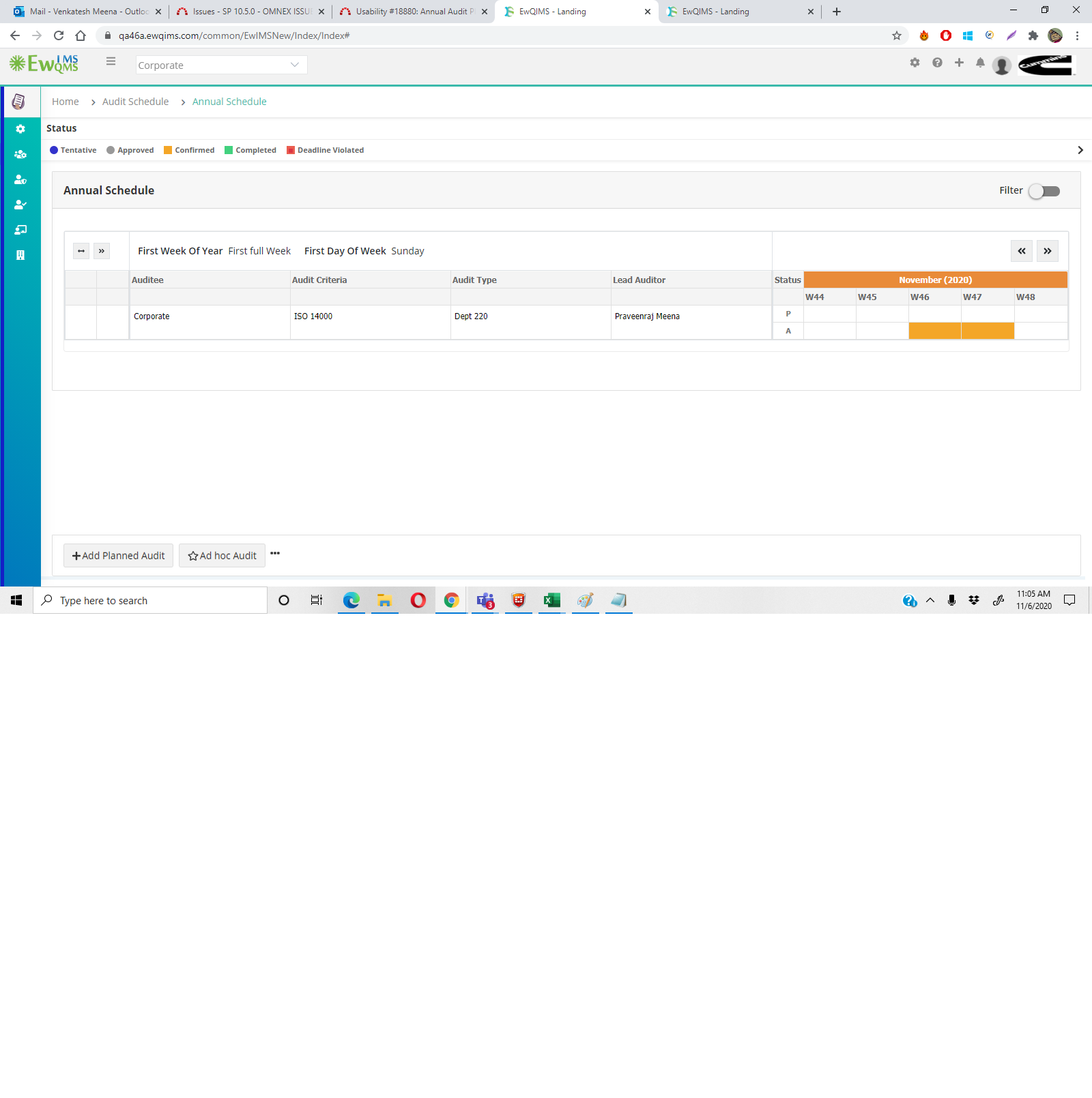
4. Week # showing center text and month in left side
5. Month and blocking box (Week #) is not same. Design is not correct
6. There is no space between menu and page. when compare with other screens.
7. After publishing planned audit, system forcing to close success message, then only page getting refreshed. After publish and after success message, system has to refresh the page automatically
8. Annual Audit / actual audit : Mandatory fields not highlighted in * Mark
9. Actual Audit :
1. Design has to improve.End date and time size is not same with start date and time
2. Process : Assigned and Unassigned process tab is not with other fields and background color has to change.
3. Audit assign filters : Entity patch is not displayed fully even have blank space.
4. Show all for auditors is wrapped text. That has to change.
5. Filters and audit assign page is not same in same order
10. Blank space is displayed on bottom of the page of annual schedule
11. Audit schedule-> Filter -> Reduce the auditor dropdown size in audit schedule page.
Files
| Design issues.png (29.8 KB) Design issues.png | |||
| Center.png (149 KB) Center.png | |||
| Done_Capture.PNG (34.3 KB) Done_Capture.PNG |